|
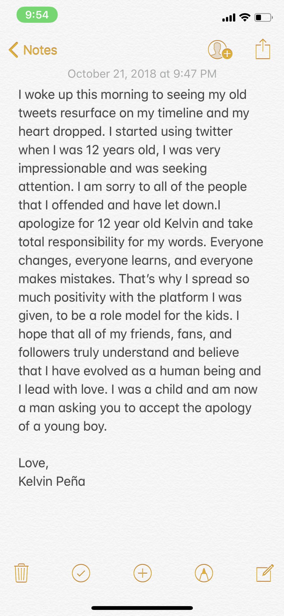
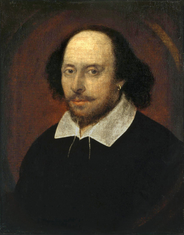
In the digital age, we have all witnessed our fair share of public shame towards people all throughout the world. Jon Ronson’s So You’ve Been Publicly Shamed relays case studies exploring the morality and widespread nature of digital shaming, particularly on social media sites like Facebook and Twitter. These studies show how the mob mentality can move as fast as minutes and hours against a person. What if you became an internet sensation overnight, to then be shamed just as fast two years after you gained your newfound fame? Kelvin Peña, also known as “Brother Nature,” a 20-year-old from New York, became a Twitter superstar in 2016 after his various videos of feeding and endearingly conversing with deer and other animals went viral. He calls the deer his “Deer Gang.” Honestly, it’s phenomenal and everyone should watch his videos. A commonality among internet stars is the dreaded moment when someone digs up their old social media posts or finds out something terribly offensive about them and leaks it for the whole world to see, hear, and more importantly, shame. This is rather reminiscent to Michael Moynihan from So You’ve Been Publicly Shamed as these accounts go out of their way to humiliate celebrities like Peña because they think they are doing the right thing, when in reality they may be doing more harm than good. In October of 2018, Twitter went ablaze when screenshots of Peña’s tweets dating back to 2011. They were crude and offensive to say the least, one of which includes a swastika and the phrase “HEIL HITLER!” More tweets are shown in the image below. There was a slew of tweets that day of people who made the decision to “cancel” Brother Nature based on the tweets being brought into light. But how young was he? He was 12 years old. 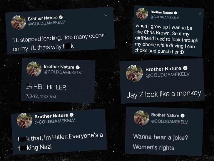 From a rhetorical standpoint, the purpose of author 12-year-old Peña’s tweets was to either impress or to shock his audience, also known as his Twitter followers, who were presumably his 12-year-old friends. When I was 12, I certainly did some stupid things to gain some attention from others. Twitter, especially in its beginnings, is a place where people can say anything their hearts desire—as long as it fits the character limit. His derogatory statements would go under the genre of social media posts, particularly labelled as tweets that are known for their short-winded stories. 2011-2013 were also times when users online were not as interested in finding old posts about celebrities because they weren’t in existence yet. It appears most of the tweets people apologize for were made during this time period, adding context to not only Peña’s age but to the environment where he was sharing this information. To put it in blunt terms, people seemed to not care as much as they do today. Later that night, Peña shared an apology on his Instagram writing about how he was a young person wanting attention when he first wrote the posts. “I was a child and am now a man asking you to accept the apology of a young boy,” Peña wrote in his message. He is now writing to an audience of more socially aware, sensitive internet users who are upset at his past tweets. It’s a no-brainer he would write an apology for the purpose of rebuilding his reputation. Granted, he was known for being one of the least problematic celebrities online prior to this situation.
Justine Sacco from Chapter Four is a prime case study to explore when we think about Twitter shaming. Although her tweet may not have been made in the same context as Peña—she was a grown woman and he was a child—she was still subject to criticism by Twitter users based on a single distasteful joke she wrote. Both instances were initiated when the authors wrote their insensitive posts, but one was let free because he was a young boy and an impressionable internet celebrity while the other was an average woman who was certainly old enough to “know better.” It is a logical assumption that people should be harsher towards adults when occurrences like these happen, but I find the best solution to any situation like Peña’s or Sacco’s is to face them with an open mind. That does not mean users have to accept ignorant or hateful words, but especially in cases of extremely brief posts it is important to at least learn context before immediately jumping on someone.
“The flaws of some people lead to horrors inflicted on others. And then there are more human flaws that, when you shine a light onto them, de-demonize people who might otherwise be seen as ogres” (Ronson, 224). This quote shows the spectrum of how shaming is perceived online. For both victims, their mishaps are still on the first pages of their Google searches. These nightmares will always linger on the Internet until something makes it magically disappear. However, Peña still has his livelihood, while Sacco had to start from nothing all over again because she lost her favorite job at a PR firm. Sacco lived the horrors of having human flaws, while Peña sheds light on how we were all immature kids who make really, really bad decisions at times. Both stories share a lesson of how society can make or break a career in a matter of hours based on tweets no matter when or under what circumstance they were made. Whether someone is a celebrity or an average person, their lives can be at risk of being completely overturned when the wrong post is in the wrong person’s hand. That is why we as viewers and aware users of the internet need to focus on all sides to the story and be a little more sympathetic to apologies when we read them and pay attention to the guilty party’s actions before and after an apology to witness a change in behavior. There may be more information than just the post at surface level; we are more than words on a screen, and we all have the ability to grow and change like Brother Nature.
2 Comments
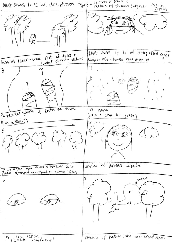
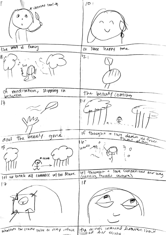
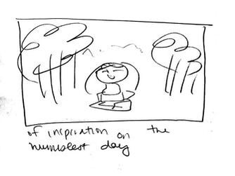
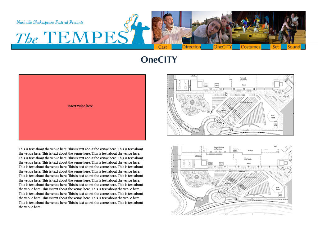
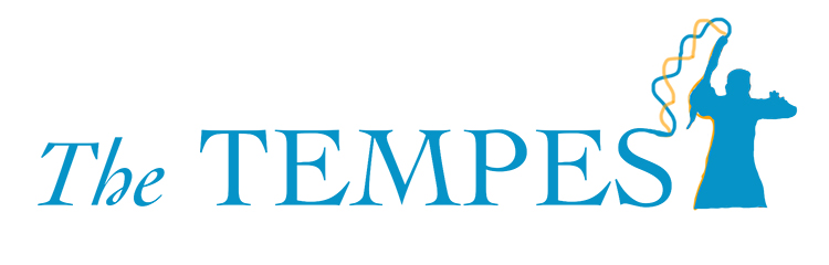
It is finally time to create our piece for the Nashville Shakespeare Performance Archive. I really enjoyed creating these drafts and I cannot wait to see what we will do with each other's works in the near future. The logo was the first task I handled. I wanted to capture the element of magic that is present within the play itself as well as in the director's interpretation of the show, so I thought of the concept of the final "T" in "The Tempest" being a silhouette of Prospero holding his staff from the Nashville Shakespeare Festival's official promotional photos. His arms are positioned similar in a "T" shape, so I thought it would be a unique customized touch to include that within the logo because it only is significant to this production of The Tempest. From the top tip of the staff there are two waves that connect to the "S" at the end of "Tempest" to bring some cohesion to the logo. "Tempest" is capitalized while "The" is in a standard capitalization and italicized to add contrast between both words. The color scheme includes hues of blue, orange, and a reddish coral. This play is set on an island, and the inciting action of the plot is a shipwreck, so blue is an appropriate base color to the scheme. Orange is blue's complement, and the other warm tone of the red also stands out along the cooler color blue. I wanted to be cognizant of what colors were used not only in the production of the show, but of the promotional materials used for advertising purposes because this archive is showcasing the play to those who were unable to see it. I am undoubtedly a beginner at InDesign, but it was a pleasant learning experience creating the mock-up for the venue content page. The logo is at the top left of the page. I added “Nashville Shakespeare Festival Presents” in the space above it to fill the white space, but I wouldn’t officially add it to the logo if we use it on other parts of the website because I don’t consider that to be a tagline and I don’t want it to be too wordy. Next to the logo is the navbar that sits on a header shape which is the same color as the logo. Each link is on an orange button so it is easier to see against the blue, and the navbar is currently on the right side of the page. I omitted the word “Design” from the crew’s links because it appeared redundant, especially when all three links are consecutively in a row. Above the navbar are some photos from the production; it would be cool to add a slideshow here or on the home page with links to the full size images. I considered having a gallery link with all the photos we wanted to add regardless of whether they fit with any of the categories each group is working on just to give the audience as many visuals of the production as possible. Creating the layout for the content of our venue page was challenging. Quite honestly I’m not one hundred percent pleased with how the layout turned out, but I can see this being applied to our archive. I wanted to make sure the video was at the top or near wherever it is mentioned in the text. It’s subject to how much we want to write about the venue and whether we will have blocks of paragraphs or more captions and explosive sentences. Regardless of my opinion on my own layout, I can see this being applied for the design crew pages with many images that can be placed next to text. I think having the ability to scroll through our web pages will be super helpful when we finally create them because it would help the formatting be cleaner if the design was in a more vertical layout rather than the four quadrants I made. I have a feeling our archive is going to look spectacular, and I am excited to see the drafts my peers have to share with us!
There are many aspects to websites a developer must focus on to create the best product for themselves or their client. I really enjoyed having the opportunity to make a personal website that showcased who I am instead of previous projects when I would make sites for others.
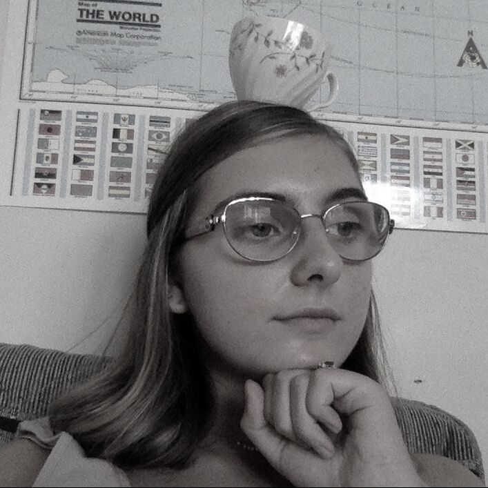
Rather than using a template, I chose to challenge myself by coding from scratch in Brackets, the software I have used in the past (although BBEdit is very helpful as well). I started with my homepage and added my navigation links. Once I was comfortable with the skeleton of my index, I moved on to the linked webpages including “about” and “poetry.” When I would experience a challenge, I always referenced W3C; it’s a very helpful resource. Images were honestly the most tedious to handle because I have been accustomed to sizing them within HTML instead of having them properly sized via Photoshop prior to adding it to my site. It took no more than 10 minutes to resize all my massive images to something more usable, and once I applied it to my website it was much easier than having to change the sizing in my code. I like to keep my goals realistic, so I am actually really happy with how my website looks because it was just what I had in mind on top of adding a fun message with a button coded with JavaScript. Had I been an expert in code, I would have loved to have a fading introductory message before users went on the site to add some drama to the whole experience. It would have been really fun to add floating images that bounced from the margins, too. I was thinking about transparent images of possums because they’re my favorite animal. I wasn’t sure if I needed to use JavaScript or if it was possible through CSS to bring that idea to fruition, but after some time I decided to polish what I already had. I wanted to take a minimalistic approach to my website because I find it to be more enjoyable compared to a busy, chaotic webpage. Repetition is important as I make a website, and I find the best way to implement cohesiveness in a site is with a set font and color scheme. While coloring the text, I knew the font had to be black because I initially intended to have a colorful background so it would be easier to read. I added a white shadow to the header text and the text on the homepage to make it stand out. Alignment was another design strategy I wanted to really focus on as everything is aligned in the center bringing all the content in full view for the user. I struggled with proximity because, although I still have my content near each other, I wanted their to be enough padding in between each element so it wouldn’t get too crowded on the page. The linguistic mode is conveyed as I use very casual language in lowercase on my website to represent how I live—more so attempt to live—in a relaxed state as well as driving home that I am a 19-year-old girl in the digital age. I used the visual mode to showcase who I am as well as what I find to be aesthetically pleasing. The four photographs on my homepage bring me joy and I hope they intrigue the audience. My picture in the “about” page has hues of blue and is a recognizable image of me to show users who I am along with information about me. I used a color scheme of cotton candy colors: light blue, lavender, and light pink, which are seen as a gradient in the background of all the internal links on my website. Not only are these my favorite colors, but I hope to bring a calming atmosphere with my colors. Overall, I really enjoyed myself during this process and learned that there is more to a website than just a layout and color scheme. There are rhetorical devices that are used to provide users with an optimal experience online, and I hope I effectively implemented them in my own introductory site for my audience to appreciate. In the age of technology, everyone is exposed to a plethora of easily accessible information that users take advantage of every day. Digital archives are a helpful resource to learn more about any topic, especially when it comes to an author with such an elaborate body of work like Shakespeare. Although all the Belmont Folger Grant links are within a similar genre of archives, each one varied in purpose, audience, context, and authors. The Internet Shakespeare Editions' online archive effectively conveys plenty of scholarly sources and insights on Shakespeare's life and creations portraying a clear purpose of educating its audience who are more than likely to be students or anyone who has the intention to perform research of Shakespeare. Pieces and links selected were in abundance which relates to how the authors of the website are academics themselves who are well-versed in the Bard, or at least they are well-connected to those who are.
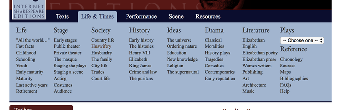 A multitude of links in the "Life & Times" tab in the navigation bar. The navigation bar holds many drop-down lists for users to find what resources they are looking for in particular. Each drop down list is a link to one of the countless web pages on the site that provides facts and interpretations of literary works by Shakespeare. Although it is certainly abundant in information, there are too many links within the menu, particularly in the “Life and Times” tab, or at least too many that have the same font style under one color. A sea of links within the navigation shows how much information the site actually has to offer which communicates the organization’s willingness to educate the audience as well as conveying the amount of information the authors are able to share based on knowledge revealing prowess in Shakespeare’s literature.
Internet Shakespeare Editions is a non-profit educational organization, so it is important to understand the context that although its main goal is to help its audience members—students and academics—to learn about Shakespeare, there is the other motive of gaining “friends,” or financial donors of the group to keep it up-and-running. In the footer navigation, there is a link mentioning becoming a friend of the ISE, which appeals to those who want to donate to the cause. According to ISE, the non-profit runs the website thanks to contributions from professors and researchers around the world who gave information to be put on the site, meaning the authors are connected to highly intelligent and expert Shakespeare educators who share their ideas. Most importantly, the whole organization is run through the University of Victoria in British Columbia, Canada. The fact that the website is affiliated with a college adds more credibility towards the author of the website alongside additions from scholars as found in the “Acknowledgements” page. This page gives credit where it is due to authors and their research as it is assisting in the process. Overall, although navigation is slightly overwhelming, the Internet Shakespeare Edition has thoroughly presented its purpose to educate its audience of academics are researching about Shakespeare, while also subtly asking for a donation to the organization. The site has also shown its scholarly authors who are not only explicitly recognized, but whose knowledge is reflected in informational pages about any topic pertaining to the playwright or his work. Visitors of the site who comprehensive research of Shakespeare will certainly not be disappointed. |
hi therei'm olivia. i am a sophomore music business major and writing & rhetoric minor. let's be digitally literate together <3 |
||||||||||
