|
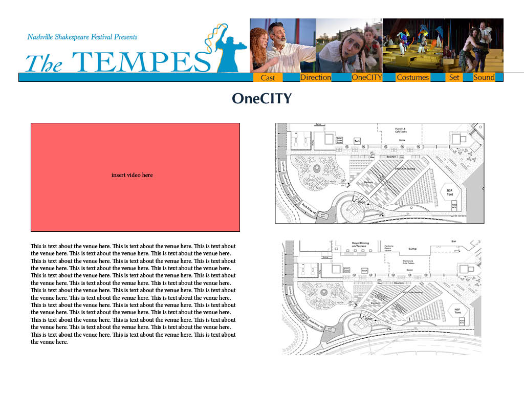
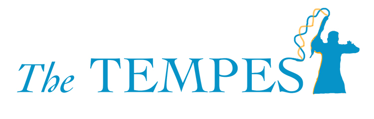
It is finally time to create our piece for the Nashville Shakespeare Performance Archive. I really enjoyed creating these drafts and I cannot wait to see what we will do with each other's works in the near future. The logo was the first task I handled. I wanted to capture the element of magic that is present within the play itself as well as in the director's interpretation of the show, so I thought of the concept of the final "T" in "The Tempest" being a silhouette of Prospero holding his staff from the Nashville Shakespeare Festival's official promotional photos. His arms are positioned similar in a "T" shape, so I thought it would be a unique customized touch to include that within the logo because it only is significant to this production of The Tempest. From the top tip of the staff there are two waves that connect to the "S" at the end of "Tempest" to bring some cohesion to the logo. "Tempest" is capitalized while "The" is in a standard capitalization and italicized to add contrast between both words. The color scheme includes hues of blue, orange, and a reddish coral. This play is set on an island, and the inciting action of the plot is a shipwreck, so blue is an appropriate base color to the scheme. Orange is blue's complement, and the other warm tone of the red also stands out along the cooler color blue. I wanted to be cognizant of what colors were used not only in the production of the show, but of the promotional materials used for advertising purposes because this archive is showcasing the play to those who were unable to see it. I am undoubtedly a beginner at InDesign, but it was a pleasant learning experience creating the mock-up for the venue content page. The logo is at the top left of the page. I added “Nashville Shakespeare Festival Presents” in the space above it to fill the white space, but I wouldn’t officially add it to the logo if we use it on other parts of the website because I don’t consider that to be a tagline and I don’t want it to be too wordy. Next to the logo is the navbar that sits on a header shape which is the same color as the logo. Each link is on an orange button so it is easier to see against the blue, and the navbar is currently on the right side of the page. I omitted the word “Design” from the crew’s links because it appeared redundant, especially when all three links are consecutively in a row. Above the navbar are some photos from the production; it would be cool to add a slideshow here or on the home page with links to the full size images. I considered having a gallery link with all the photos we wanted to add regardless of whether they fit with any of the categories each group is working on just to give the audience as many visuals of the production as possible. Creating the layout for the content of our venue page was challenging. Quite honestly I’m not one hundred percent pleased with how the layout turned out, but I can see this being applied to our archive. I wanted to make sure the video was at the top or near wherever it is mentioned in the text. It’s subject to how much we want to write about the venue and whether we will have blocks of paragraphs or more captions and explosive sentences. Regardless of my opinion on my own layout, I can see this being applied for the design crew pages with many images that can be placed next to text. I think having the ability to scroll through our web pages will be super helpful when we finally create them because it would help the formatting be cleaner if the design was in a more vertical layout rather than the four quadrants I made. I have a feeling our archive is going to look spectacular, and I am excited to see the drafts my peers have to share with us!
8 Comments
Cooper
10/29/2019 11:20:04 am
1st choice for logo
Ethan Hobson
10/29/2019 11:21:04 am
Logo: 1
anon
10/29/2019 11:21:55 am
logo 1
Nicole
10/29/2019 11:23:10 am
Logo 1
Brooke
10/29/2019 11:24:03 am
1
Alexandra
10/29/2019 11:24:37 am
2 choice
Jessica
10/29/2019 11:25:33 am
2 Leave a Reply. |
hi therei'm olivia. i am a sophomore music business major and writing & rhetoric minor. let's be digitally literate together <3 |
||||
